How Much Does the Top 1% Make and What It Means
How much does the top 1% make nationally and by state? See 2026 income thresholds, wages vs wealth, and what it takes to join the top 1%.

Daniel Anderson
Editor, The Money Maniac
September 21, 2026
14 min read
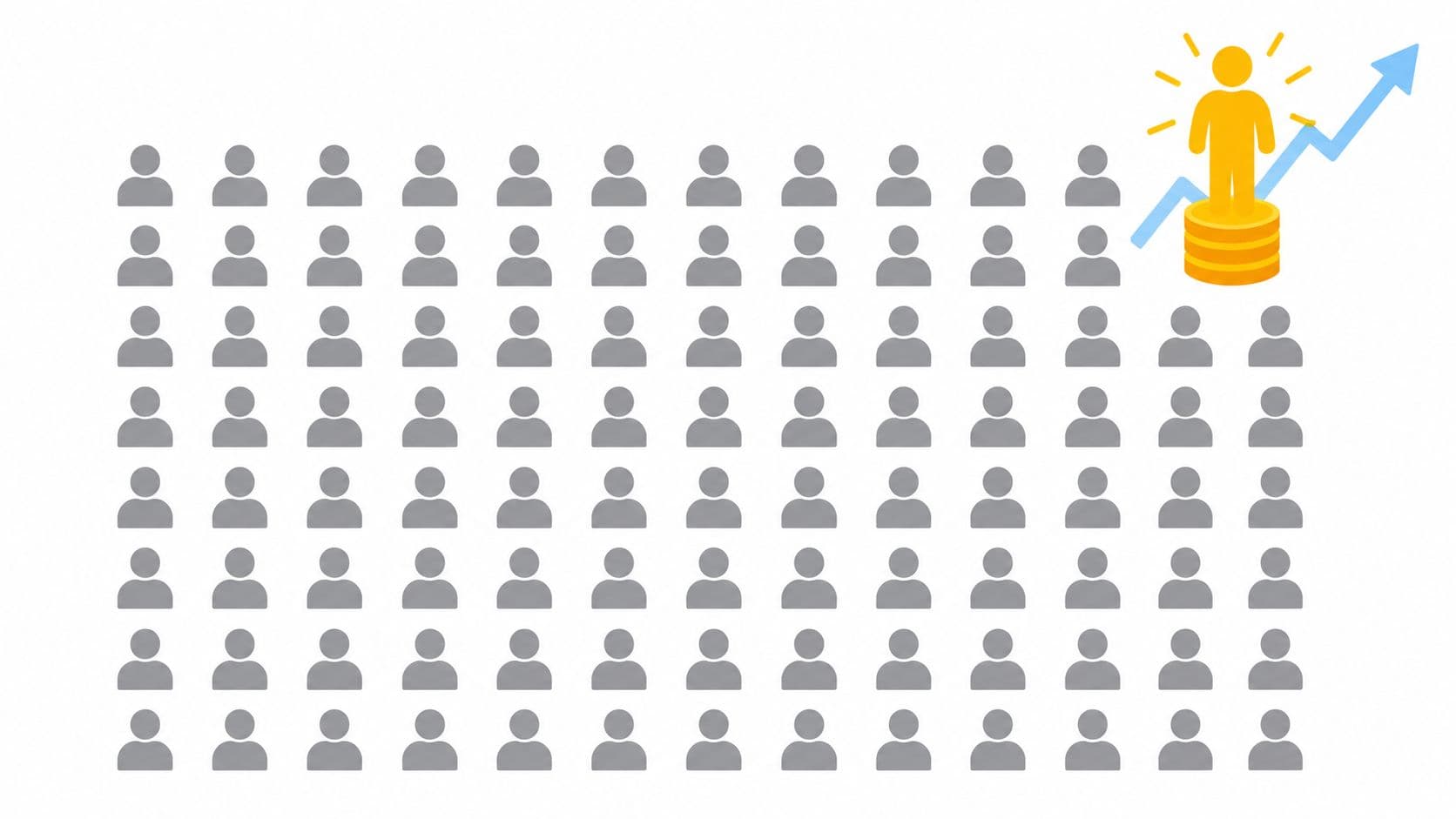
In the United States, getting into the top 1% currently means roughly $682,500 in household income or about $748,000 in adjusted gross income for 2026, depending on the dataset. That number also swings hard by state, from about $426,000 at the low end to roughly $1.1 million at the high end.
That surprises people because most of us treat “top 1%” like a fixed salary badge. It isn't. It's a position in a distribution, and distributions move. Different data sources count income differently, different years capture different market conditions, and different states live in very different economic universes.
If you've ever searched how much does the top 1% make, you were probably hoping for one clean number. You can get a headline number, sure. But the useful answer is messier and much more interesting.
A surgeon in one state, a business owner with a big sale, and an executive with stock gains can all land in the same percentile for a year while having very different financial lives. That's why the label causes so much confusion. People hear “top 1%” and picture a permanent club of giant salaries. The data say otherwise.
What matters is understanding what the threshold measures, what kind of income sits behind it, and why your ZIP code changes the conversation. Once you see that, the question stops being “What magic salary gets me in?” and becomes “What exactly is this benchmark telling me?” Much better question. Also less likely to ruin a dinner conversation.
What Everyone Gets Wrong About the Top 1 Percent
Think the top 1% is a single national paycheck number. It's not. It's a moving cutoff that depends on how income is measured, which year you use, and where you live.
That's why you'll see one credible 2026 estimate put the U.S. household threshold near $682,500, while another analysis using IRS state data places the national cutoff closer to $748,000. The practical takeaway is simple: treat any single “top 1%” figure as a snapshot with assumptions attached, not a timeless truth.
Why the headline number keeps changing
A threshold can rise even if your own pay doesn't. Inflation pushes nominal incomes up. Stock markets and business profits can lift reported incomes at the top. Data methods matter too. One source may focus on households. Another may use IRS adjusted gross income.
That sounds technical, but the plain-English version is easier: two honest scorekeepers can count the same game differently.
Practical rule: When you read a top 1% number, ask three questions. What income measure is it using, what year is it based on, and is it national or state-specific?
Why this matters more than trivia
The top 1% isn't just a cocktail-party label. It sits near the center of debates about inequality, tax policy, wage growth, and wealth building. If you misunderstand the threshold, you can also misunderstand what's happening in the broader economy.
A lot of readers also blur income with wealth. Separate issue. A household can have a very high-income year and still not be especially wealthy. Another household can have modest current income and large assets built over time.
Here's the useful lens for the rest of this piece:
- The cutoff matters because it tells you where the line is.
- The composition matters because salary is only part of the story.
- The location matters because state lines do a lot of work.
- The time frame matters because one big year can temporarily change the label.
If you keep those four ideas straight, “how much does the top 1% make” becomes a lot less mysterious and a lot more useful.
How Income Percentiles Actually Work
Income percentiles work like a ranked list, not a salary title.
Line up incomes from lowest to highest and draw a mark near the top. The top 1% starts at the income needed to cross that mark. Thresholds are minimum cutoffs, not averages. The people above the line can be clustered near it, or spread far beyond it.
That is why one top 1% number can create so much confusion. Readers often hear a threshold and treat it like the standard paycheck for everyone in the group. It is closer to a doorway than a description of the whole room.
Thresholds are cutoffs, not averages
Suppose the line for a given year is $748,000. Hitting that number places a household at the edge of the top 1%. Some households above that line are only a little higher. Others earn several times more. A percentile tells you where the floor is, not what life looks like for everyone upstairs.
The practical mistake is easy to make. People compare one salary to one threshold and assume they now understand the group. But percentiles are moving targets. They shift with inflation, bonuses, business income, market gains, and the way the data set defines income in the first place.
A marathon analogy helps here. Qualifying time gets you into the race. It does not tell you whether the runners just squeaked in or finished far ahead of the pack.
AGI, household income, and salary are related, but different
Percentile math gets slippery in a useful way.
- Adjusted gross income comes from tax returns and follows tax rules.
- Household income groups income across a household, which can include more than one earner.
- Salary or wages cover only one lane of income and leave out a lot of what pushes high earners into top brackets.
That last point matters more than readers expect. A household can look ordinary on a wage-only basis and still land much higher once business profits, investment income, or a large capital gain shows up. Another household can post a huge one-year number because they sold a business or exercised stock options, then fall back the next year. So the top 1% is less like a fixed club with a permanent membership card and more like a line that moves by place, by year, and by income type.
Survey-based estimates and tax-return estimates can also land on different thresholds because they are counting with different rulebooks. Analysts using household survey data are answering one version of the question. Analysts using IRS-based income are answering another.
Why your personal comparison can go wrong fast
If you compare your paycheck to a top 1% figure, make sure you are matching the same measure. Salary-to-AGI is not a clean comparison. Salary-to-household income is not perfect either if your household has bonuses, side business income, or investment gains.
For a quicker baseline, start with a plain-English benchmark like how your salary compares. Then check whether the percentile figure you are using is national or state-specific, annual or based on tax data, and focused on wages, household income, or AGI.
One more guardrail. Income and wealth are different scoreboards. A household can post a top-percentile income in one strong year and still be far from financially independent.
How Much the Top 1 Percent Makes in the United States Right Now
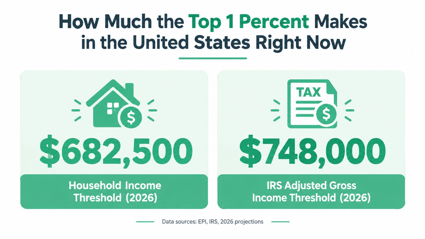
For 2026, the national top 1% threshold is not one neat number. A household-income estimate puts it at about $682,500, while an IRS-based adjusted gross income estimate puts it closer to $748,000.
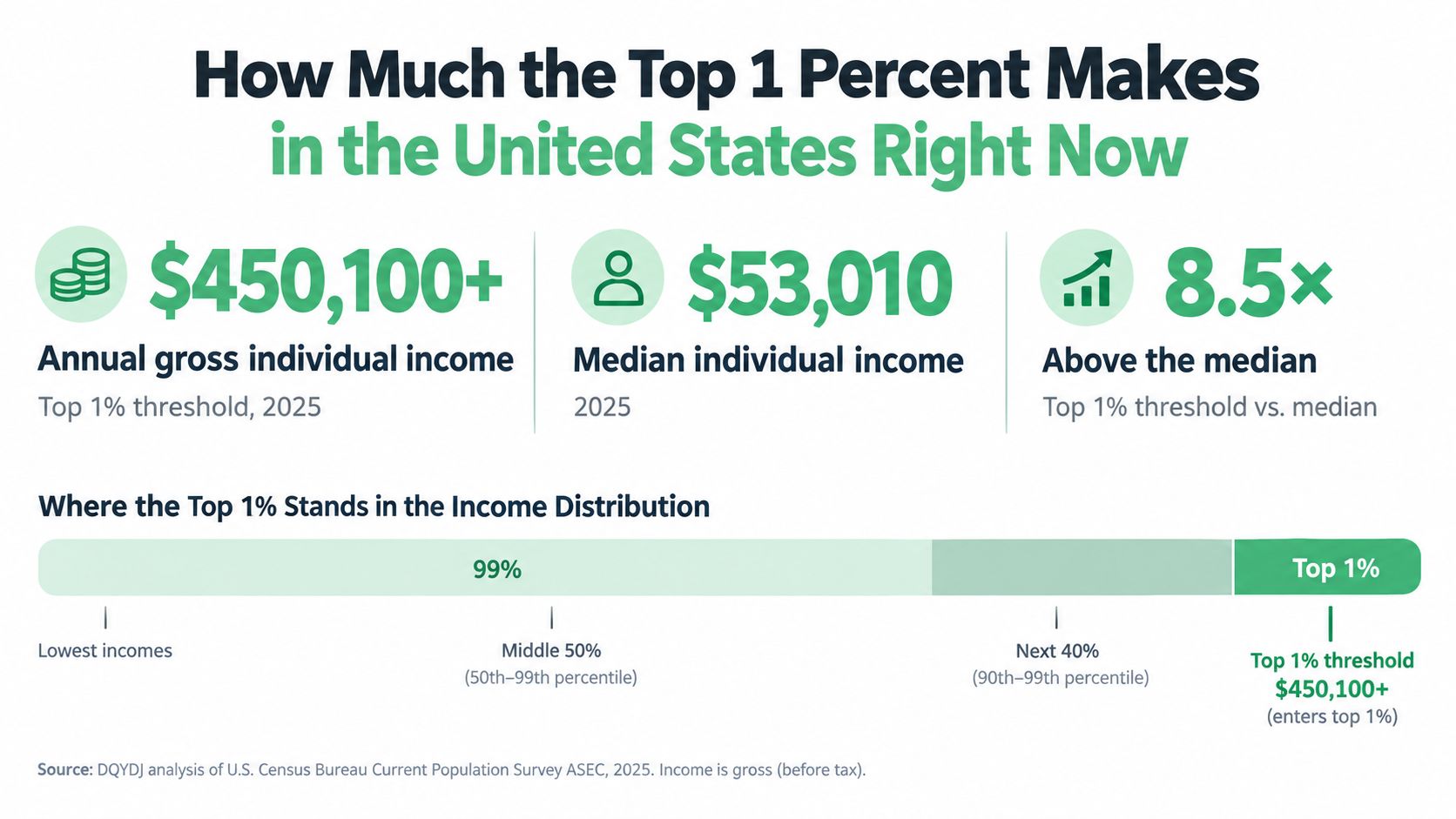
Both figures can be reasonable because they are measuring different versions of income. Household income is one lens. IRS adjusted gross income is another. If you switch the ruler, the measurement changes.
That sounds fussy, but it matters. A two-earner household with salaries and bonuses may look different from a tax return with business income, investment gains, or deductions shaping AGI. Same broad question. Different accounting lane.
A better way to read the national figure is to treat it as a range with a label attached. The label is the important part.
Ask these questions:
- Is this based on household income or tax-return income like AGI?
- Is it trying to describe one recent year, or a period that may smooth things out differently?
- Does it capture income that shows up outside regular paychecks, such as business profits or capital gains?
Those questions clear up why top 1% headlines often seem to disagree.
The practical point is simple. The top 1% is a moving line in a distribution, not a fixed salary club. In one year, a founder who sells part of a business can jump far above the cutoff. In another year, that same household may fall back below it even if their lifestyle barely changes. A surgeon on steady wages and an owner with lumpy business income can both reach the same percentile through very different paths.
That is also why annual comparisons can mislead. One-year income at the top tends to swing more than people expect because bonuses, stock sales, and pass-through business profits do not arrive in a tidy monthly pattern. If you are trying to compare yourself to these thresholds, matching your W-2 salary to a national top 1% figure is like comparing your speedometer to someone else's trip average. Related, but not the same measure.
Use the national number as a benchmark, then read the fine print before drawing conclusions. Helpful reference. Weak identity.
Where You Live Changes the Answer Dramatically
The gap is huge. Recent state comparisons put the top 1% cutoff at roughly $445,892 in West Virginia and $1,156,664 in Washington, D.C..
That difference changes the whole conversation. “Top 1% income” is not a single salary badge you either have or do not have. It works more like a race split. The national average pace tells you something, but your course still depends on where you are running.
A small table makes this clearer
| Location | Top 1 Percent Threshold | Top 10 Percent Threshold for Context |
|---|---|---|
| United States national IRS-based figure | About $748,000 | Not provided |
| Washington, D.C. | $1,156,664 | Not provided |
| West Virginia | $445,892 | $158,674 |
A household earning $500,000 lands in very different percentile territory depending on the state. In one place, that income may clear the local top 1% line. In another, it is well short. Same income. Different distribution.
That is the part readers often miss. Percentiles are relative. They rank your income against other incomes in the same pool, and the pool changes by location.
What state thresholds actually tell you
State thresholds answer a practical question: who counts as a top earner here? That “here” matters because local economies are built differently. Some states have more high-paying finance, tech, or law income. Others have lower median incomes, fewer extreme earners, or a different mix of wages, business profits, and investment income.
So a national figure is useful as a broad benchmark, but it can mislead if you use it like a local planning tool. If you are deciding whether your pay is high for your market, whether a move makes sense, or how unusual your income really is in your area, the state-level cutoff is the better measuring stick.
Annual pay and local rank are not the same thing
This gets even trickier because location and income type interact. A household with a steady W-2 salary may compare differently with its state distribution than a household with irregular owner income or a large stock sale. In high-income states, the top 1% line can be pulled upward by people with big business and capital income, not just very high salaries.
That means a local top 1% threshold is not a clean “salary target.” It is a line that reflects the full income mix showing up on tax returns in that place for that year.
Why this matters in real life
Your local percentile often affects daily life more than the national label does. Housing markets, private school demand, state taxes, and what counts as “normal” spending all cluster locally. A household near the top of the distribution in one state may feel financially stretched in another.
That is one reason geographic arbitrage gets so much attention. A lower nominal income can buy more freedom if it also places you high in a cheaper state's income distribution.
The useful takeaway
Use the national number for context. Use the state number for planning. If you want the cleanest read, pair both with a calculator that matches your income type, household definition, and year. That is how you avoid comparing a local snapshot to a national moving target.
What the Top 1 Percent Earns and Where It Comes From
A top 1% year can come from a paycheck, but it often comes from a mix of paycheck, ownership, and timing.
Recent Federal Reserve research found that top 1% income is made up of several streams, with salaries at 35%, business ownership income at 25%, and capital gains at 22% (Federal Reserve income composition analysis). That is the part people often miss. The top 1% is not a fixed salary club. It is a place in the distribution, and many households reach it with more than one engine under the hood.
Salary matters, but ownership income changes the picture
A surgeon with a very high W-2 can land in the top 1%. So can a business owner whose company throws off profits. So can someone who sells appreciated stock after years of gains piled up in the background.
Those are very different financial lives, even if the tax return for that year lands in the same percentile.
Salary is usually the steadiest stream. Business income can swing with margins, hiring, or one unusually strong year. Capital gains are even lumpier because they appear when an asset is sold. In practice, that means two households can post the same annual income and have very different odds of repeating it next year.
Annual income and long-term income are not the same thing
This is why one-year rankings can exaggerate how far ahead a household is over time. Analysts at the Federal Reserve Bank of St. Louis noted that smoothing income over multiple years makes top-end concentration look lower than it does in single-year snapshots (St. Louis Fed review of top incomes over time).
The logic is simple. Bonuses hit once. Equity vests on a schedule. A founder may sell part of a company after a long dry spell. A household can rank in the top 1% in one tax year and look far less concentrated over a longer stretch.
That is not a data quirk. It is how real income works.
What this means if you are using the number for planning
The source of income matters almost as much as the amount.
- If your income is mostly salary, your cash flow is usually easier to predict, but there may be less flexibility around timing.
- If your income depends on a business, a top 1% year may need bigger cash buffers because the next year could look very different.
- If capital gains do heavy lifting, a single-year percentile can say more about sale timing than about durable earning power.
That is why building income-producing assets often matters more than chasing a headline percentile. Income percentiles measure where you landed this year. Assets help determine how repeatable your income is across many years.
The practical takeaway is straightforward. Top 1% income usually blends labor, ownership, and market gains. If you treat it as a salary benchmark, you miss the moving parts that put households there in the first place.
How the United States Compares to the World
The American version of top 1% income sits in a global context that is both large and uneven.
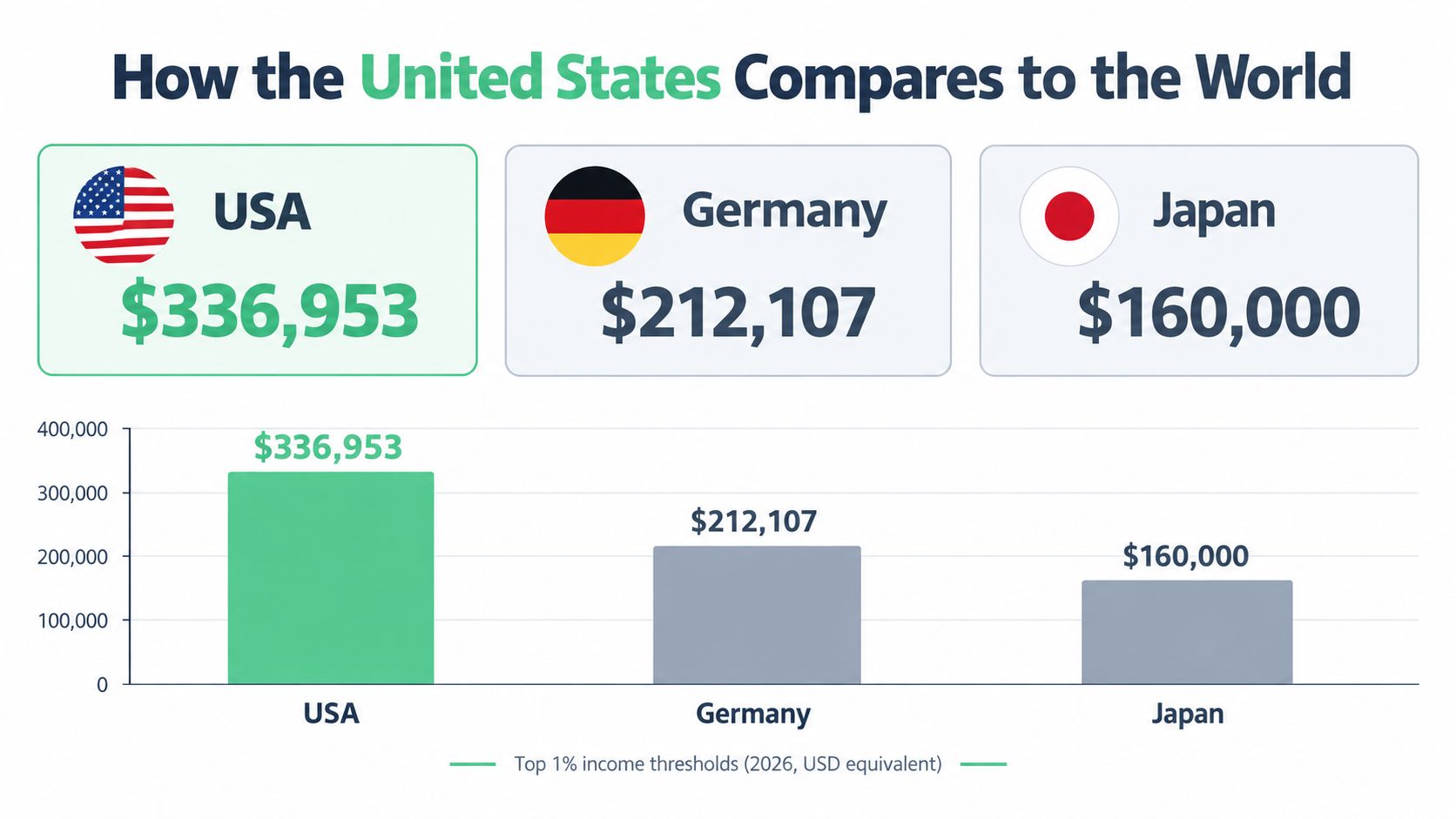
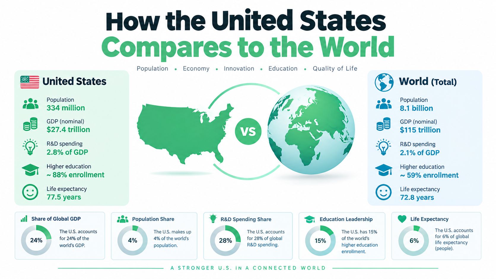
Globally, the top 1% includes about 56 million people and earned about 20.3% of global income in 2025, according to one recent estimate. The same source puts the income needed to reach the global top 1% at about $250,300 annually, or about $21,860 per month.
The U.S. threshold is high by rich-country standards
In one widely cited cross-country comparison, people in America's top 1% made at least $336,953 in annual pre-tax income, compared with $212,107 in Germany and $193,036 in Canada. The same OECD work found that the top 1% of employees in Europe typically captures about 5% to 6% of total labor income on average across European countries.
So yes, the U.S. threshold looks high. But the more revealing point is how much income accrues to the top once people get there.
The share at the top differs a lot by country
Across major OECD economies, the top 1% share of pre-tax income is below 7% in Denmark and the Netherlands but close to 20% in the United States. OECD analysis also found the difference between two major measurement approaches for the top 1% share was less than 2 percentage points in 2010, which suggests the cross-country comparisons are solid enough to be useful.
That's the bigger story. The same label, “top 1%,” can describe very different slices of national income depending on institutions, taxes, labor markets, and capital ownership.
In the U.S., top 1% income is not only high in dollars. It also captures a much larger share of total income than in several peer countries.
The global comparison keeps the U.S. number in perspective. By world standards, the bar is high but not unimaginable. By peer-country standards, the U.S. top end is unusually tall and unusually well fed.
What This Means for Your Own Financial Plan
The cleanest takeaway is this: treat the top 1% as a distribution benchmark, not a personal target.
If your goal is better financial outcomes, the more useful questions are about your income mix, savings rate, tax planning, and asset building. A moving threshold shaped by markets, state lines, and one-time gains is a lousy scoreboard for everyday decision-making.
A more practical way to use the benchmark
- Benchmark wisely: Compare yourself to the income measure that matches your situation.
- Plan for variability: If your income is uneven, build around multi-year averages, not one lucky year.
- Focus on assets: Long-term wealth usually depends on what you own, not just what you earned in one tax year.
For households moving into higher income ranges, estate planning starts to matter too. If that becomes relevant, a practical resource on how to minimize estate taxes with Bryan Fagan can help you think through what changes once income and assets rise together.
If you want to turn this topic into action, use calculators and simple planning tools. Model what a higher savings rate does. Test what debt payoff changes. See what compounding looks like in dollars instead of vibes. Percentile labels are interesting. Cash flow and net worth are what pay the bills.
Get more posts like this
One short, useful email each Friday. Free, no spam, unsubscribe anytime.